2023-2024
When more data slows decisions

How I designed an AI-powered distress detection system for school counselors – by learning that the problem wasn't information, it was speed of judgment.
AI Systems · Edtech · Counselor Dashboard · Decision Support
Lead Product Designer (Founding Role)
Context
Counselors are the hinge point. Everything depends on them.
Palo is an AI-powered Social Emotional Learning platform used by school counselors across 12+ US districts. The student app runs SEL sessions in classrooms. Counselors use what comes back from those sessions to identify students who need attention – before a small problem becomes a serious one.
The problem: Palo's curriculum was generating rich behavioral data. Mood check-ins, scenario responses, written reflections. Hundreds of data points per student, per week, across dozens of classrooms.
Counselors had more information than ever. They were using it less.
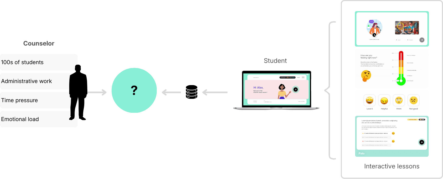
| Counselors didn't lack information. They lacked time to act on it.
> Student SEL App is a separate case study here.
First Attempt
We thought visibility was the answer.
Our initial assumption was straightforward: if we surface more student data clearly, counselors will make better decisions.
So we built a comprehensive dashboard. Emotional trend charts. Engagement levels over time. Behavioral pattern visualisations across classrooms and weeks. It looked thorough. It looked informative.
Counselors logged in once or twice. Then stopped returning.
The feedback was consistent across every pilot school: too many charts, too much interpretation required, too much time. Counselors didn't lack information. They lacked the time and cognitive space to do anything with it.
What failed
| We optimised for completeness instead of counselor intent.

Reframe
The goal wasn't to show more data. It was to help counselors act faster.
The shift happened when we stopped asking "how do we visualise this data better?" and started asking "what does a counselor actually need to do in the next 10 minutes?"
Counselors didn't want a system to analyse. They wanted one that had already done the analysis – and was waiting with an answer. This reframed the entire design problem. Not data visualisation. Decision support. Not exploration. Prioritisation.
| If an insight can't be understood and acted on in seconds, it doesn't belong in the system.
Research
Before redesigning anything, we tested inside their actual workflow.
Rather than building a new dashboard and waiting to see if it worked, I partnered with our SEL researcher to move insight delivery directly into counselors' inboxes – where they already were.
We sent bi-weekly email reports, iterating the format weekly based on feedback. This let us test signal prioritisation, language clarity, and trust without writing a line of UI code.
Four iterations. Four progressively clearer answers about what counselors would actually act on.
| A simple, prioritised list of flagged students – with just enough context. That's what worked.

System Design
Flags before frameworks.
Once we validated the signal – counselors respond best to prioritised, actionable information – the design challenge shifted to: how do we reliably generate that signal at scale?
The answer was an AI-assisted pipeline that transformed raw student responses into distress flags, rather than scores or predictions.
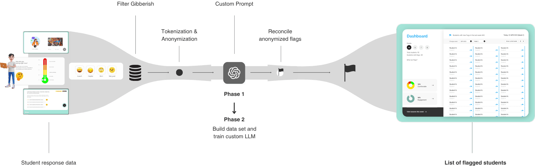
How the system worked
Student responses – mood check-ins, scenario choices, and written reflections – were tokenised, anonymised, processed through researcher-defined prompts, and analysed for unusual patterns. When a pattern crossed a defined threshold, the system flagged that student for counselor review.
Three constraints we set from the start
No scores – to avoid false precision.
No automated conclusions – counselors retained judgment.
No loss of context – every flag linked back to the student's actual responses.
These constraints weren't limitations. They were the design. An AI system that makes itself legible builds trust faster than one that claims to be accurate.
Key Design Decision
Clarity by default. Depth on demand.
With the system in place, the UX question was: how much do we show, and when?
Counselors needed to see risk quickly. But they also needed full context when they chose to act. The answer was progressive disclosure – three levels of information, each revealed only when counselor intent deepened.

| The system should follow counselor intent, not data hierarchy.
How information unfolded
Level 1 – The Watchlist. A simple, prioritised list of flagged students. No charts. No scores. Just names that needed attention.
Level 2 – Student Context. On selection: recent emotional signals, excerpts from student responses, and the lesson context that generated each flag. Everything needed to decide whether to act – nothing more.
Level 3 – Patterns Over Time. Deeper trends and correlations available only when counselors chose to explore further. Never surfaced by default.
Constraint
What we designed vs. what we shipped.
As the system moved toward production, real-world constraints shaped what was possible. Most counselors accessed Palo on low-bandwidth school Chromebooks. This directly affected every design decision.
Three deliberate tradeoffs:
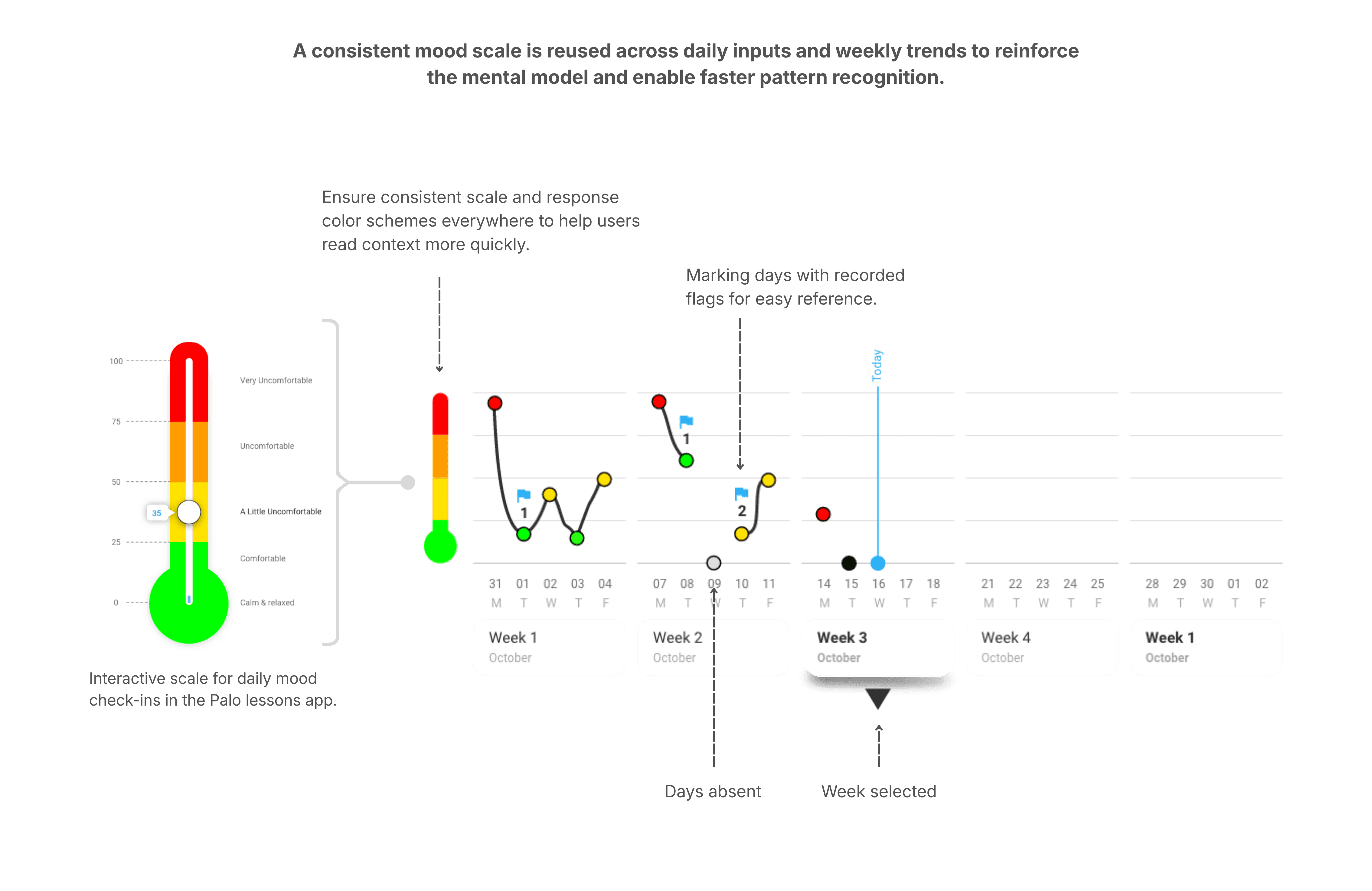
Removed complex histograms. Multi-parameter charts added processing overhead and slowed page loads on school devices. The visual richness wasn't worth the latency.
Dropped weekly mood aggregation views. Aggregated trends were useful in theory, but delayed access to urgent, student-level signals. Speed mattered more than completeness.
Replaced precision charts with a feeling scale. A simpler gradient scale aligned better with how counselors actually discussed emotional states with students – and loaded instantly.
| We optimised for reliability and clarity over visual density – because broken insight is worse than missing insight.


Final Design
Clear signals. Confident action.
The final dashboard centred on three things: speed, clarity, and trust.
Counselors land on a prioritised watchlist – only students who need attention, in the right order. From there, a single tap surfaces the context needed to decide whether to intervene. No charts to interpret. No navigation to figure out. No cognitive overhead before the work begins.


Impact
What happened when counselors actually used it.
Palo launched into its first full sales cycle after a pilot across three school districts.
~60%
reduction in counselor review time (reported by counselors)
100%
of pilot counselors extended usage and referred peers
12+
US school districts adopted Palo at launch
Insights
What this project taught me.
Speed is a design feature, not a performance metric.
In high-stakes environments, every second of unnecessary friction is a decision that doesn't get made. Designing for action means designing against cognitive load – ruthlessly, and at every layer.
Legibility matters more than sophistication in AI products.
If a user can't immediately understand why something surfaced, they won't trust it – no matter how accurate it is. The system's job is to be understood, not to be impressive.
Designing for action is fundamentally different from designing for insight.
Insight products say "here is information." Action products say "here is what to do next." The two require different information hierarchies, different interaction patterns, and a completely different definition of done.
More case studies
Making AI agents easy to build, for anyone
A no-code canvas where non-technical users build, configure, and deploy AI agents.
AI Agents · No-Code
Nagent AI
Rethinking books for the phone
A vernacular-first reading product built around engagement, habit, and mobile behavior.
Consumer App · Content · Edtech
TaccoMacco