2024–Present
Designing an AI agent builder for people who don't think in systems
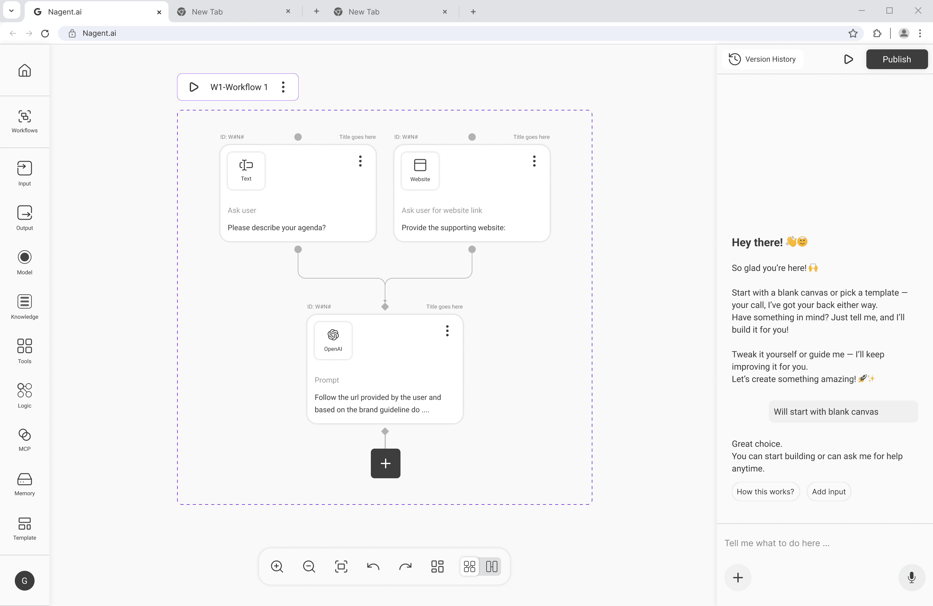
How I designed a thinking environment for non-technical users – by learning that the problem wasn't the interface, it was the sequence.
AI Systems · No-Code · Canvas · Enterprise
Founding Product Designer (0→1) · Nagent AI · 2024–Present
Context
The people who needed agents most had no way to build them.
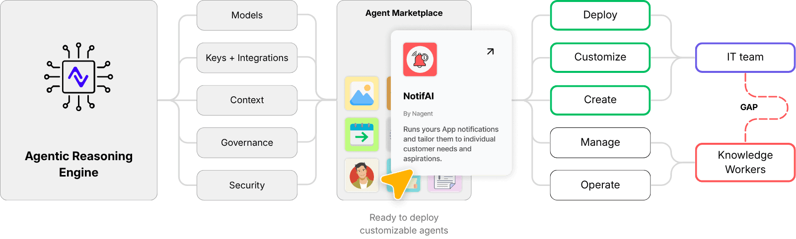
Nagent is an enterprise-grade platform for building and deploying AI agents. The infrastructure was powerful – reasoning engines, integrations,marketplace, deployment pipelines. The gap was everything in between.
70% of the SMEs in our pilots had no dedicated IT team. 90% of the knowledge workers we spoke to wanted to build agents themselves.
The problem wasn't access to AI. It was that every existing agent builder was designed for engineers. Non-technical users (Knowledge workers) – marketers, ops managers, founders – had no path in.
My role as Founding Product Designer was to design that path. From zero.
The real problem
The barrier wasn't capability. It was cognitive load.
The obvious assumption was: make the interface simpler. Clean it up. Reduce the steps.
That assumption was wrong.
The real problem was that knowledge workers couldn't form a mental model of what an agent is before they were asked to build one.
80% of users from 6 SMEs reported a lack of understanding of their agents. The hardest part isn’t deploying agents, it’s helping users trust what the agent is doing.
Configuration-first flows – name it, define it, set its parameters, then build it – assumed understanding that didn't exist yet. You can't simplify your way out of that. The sequence itself was backwards.
First principles
Creation before configuration.
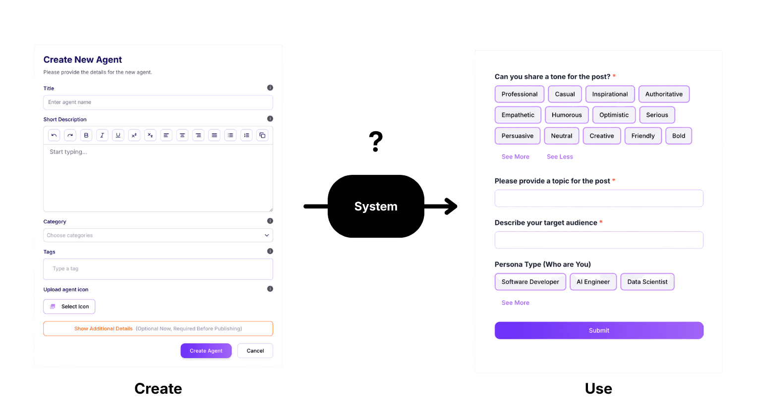
Every agent builder we studied asked you to define the agent before you built it. Name, purpose, scope – upfront, before a single node was placed. Configuration before creation.
For non-technical users, this creates a barrier at the exact moment curiosity should become momentum. The commitment cost is too high before the value is visible.We rejected this model entirely. The new north star:
structure should emerge through use, not be demanded upfront. Start building. Understand as you go. The canvas would become a thinking environment, not a configuration form.
This single decision changed every design choice that followed.
Phase 1
The lego grid worked – until it didn't.
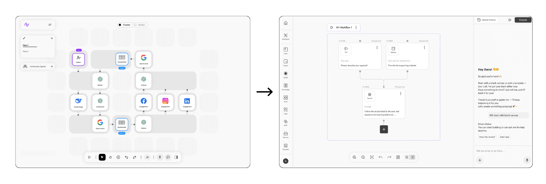
The first version was a structured grid canvas. Rectangular blocks, icon-based nodes, clear linear connections. It was familiar, learnable, and fast to start with.
We tested it with Nagent's incubation team at IIT Mandi and three partner SME teams. Early signals were promising – users could get something on the canvas quickly.
Then we watched what happened at scale. As workflows grew beyond 6–8 nodes, the grid started to fight the user. Fixed positions constrained the thinking. Logic hid inside modals that users forgot existed. People lost the thread of what they'd built – not because it was complex, but because the canvas gave them no way to hold it in their head.
80% of users in the post-test reported they didn't understand what their agent was actually doing.
| The system optimised for simplicity. It should have optimised for expressiveness.
The reframe
A flow of intent and reasoning not just automation of workflows
The shift wasn't just visual. It was conceptual.
A block says: here is a component. A card says: here is what this step is trying to do.
The difference sounds subtle. In practice it changes everything. A canvas of cards lets a user read their agent – understand it at a glance, follow the logic, spot where something is wrong – without opening a single modal. The canvas stops being a wiring diagram and starts being a readable document of intent.
This became the theory behind everything: the canvas is not a diagram of a system. It is a thinking environment where intent becomes structure over time.
| Blocks represent components. Cards communicate intent. Not a UI change – a different theory of what the canvas is for.
Design decisions
Decisions that shaped the canvas.
Cards that expose intent.
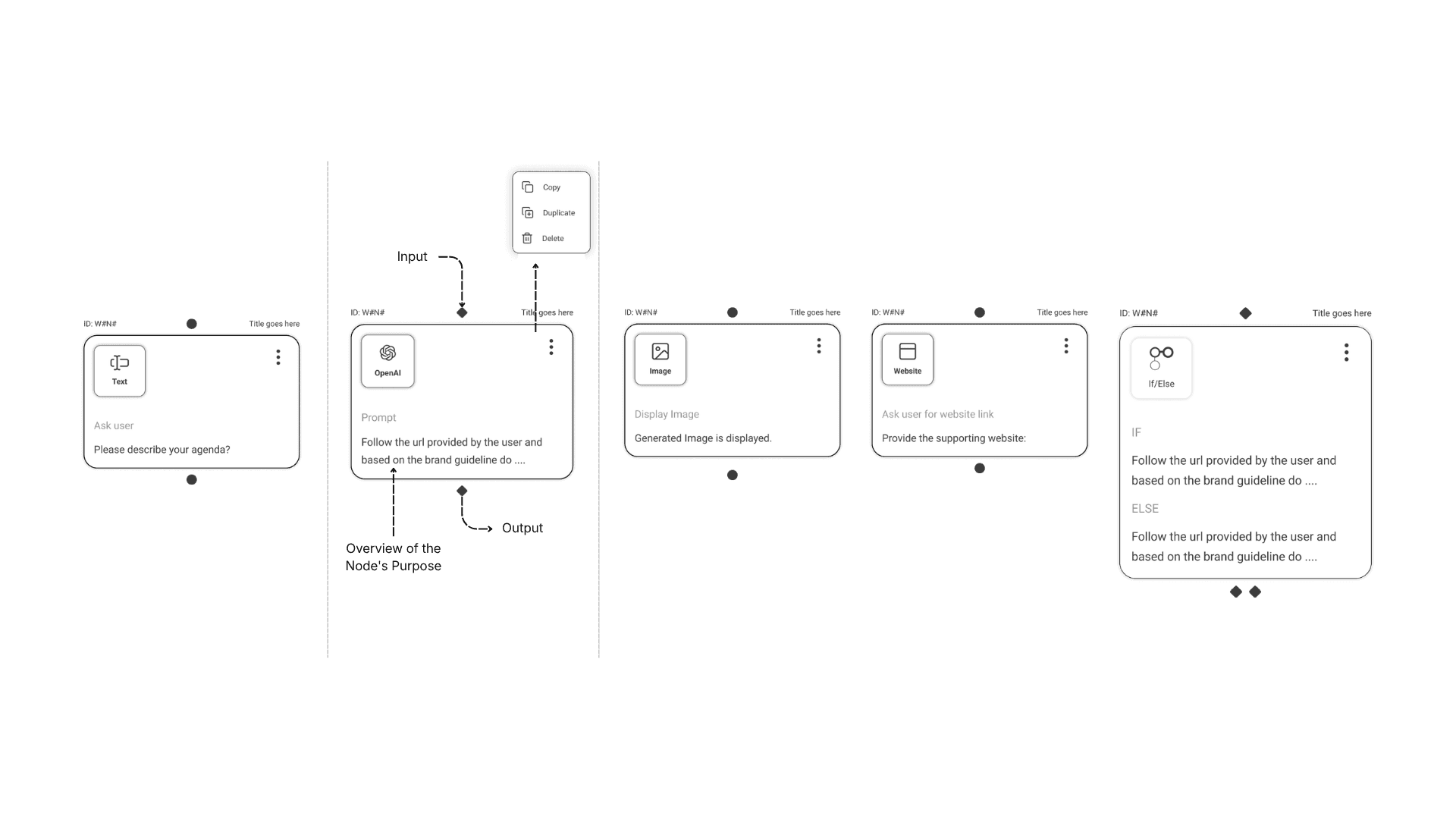
Every card surfaces what a step does, not how it does it. Name, type, a plain-language description of purpose, and immediate connections – visible by default. Nothing hidden behind a modal until the user chooses to go deeper.
Simple UX copy
The copy was designed to match how a non-technical user thinks, not how the system works. "What should this step do?" is a thinking prompt. "Configure node parameters" is a barrier.
The side sheet tradeoff.
The side sheet was a deliberate choice. We could have put configuration inline on the card – cleaner visually, but it would have collapsed the distinction between reading a workflow and editing one. The side sheet preserves that boundary. Clarity by default. Depth on demand.
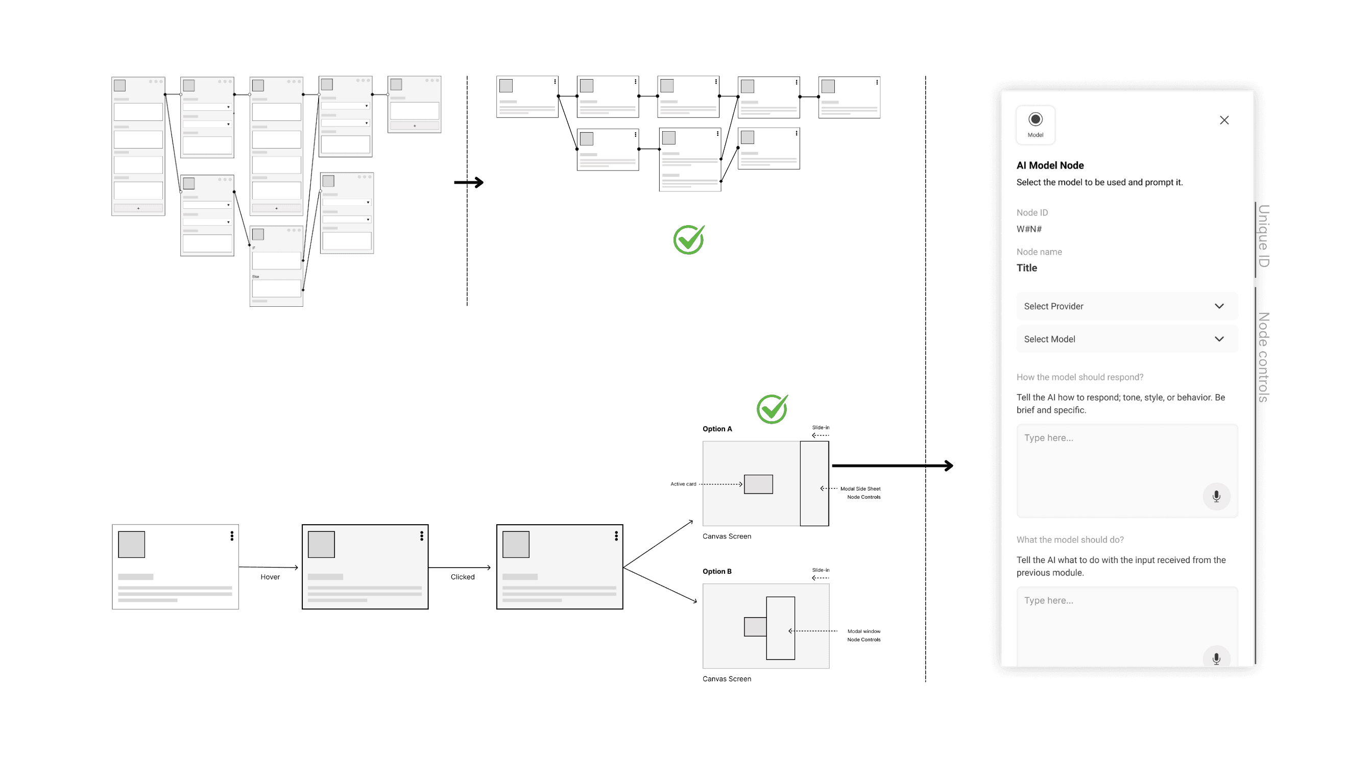
AI agents are not features or tools, but a systems that need to behave, reason, and evolve over time.
Workflow that reveals reasoning
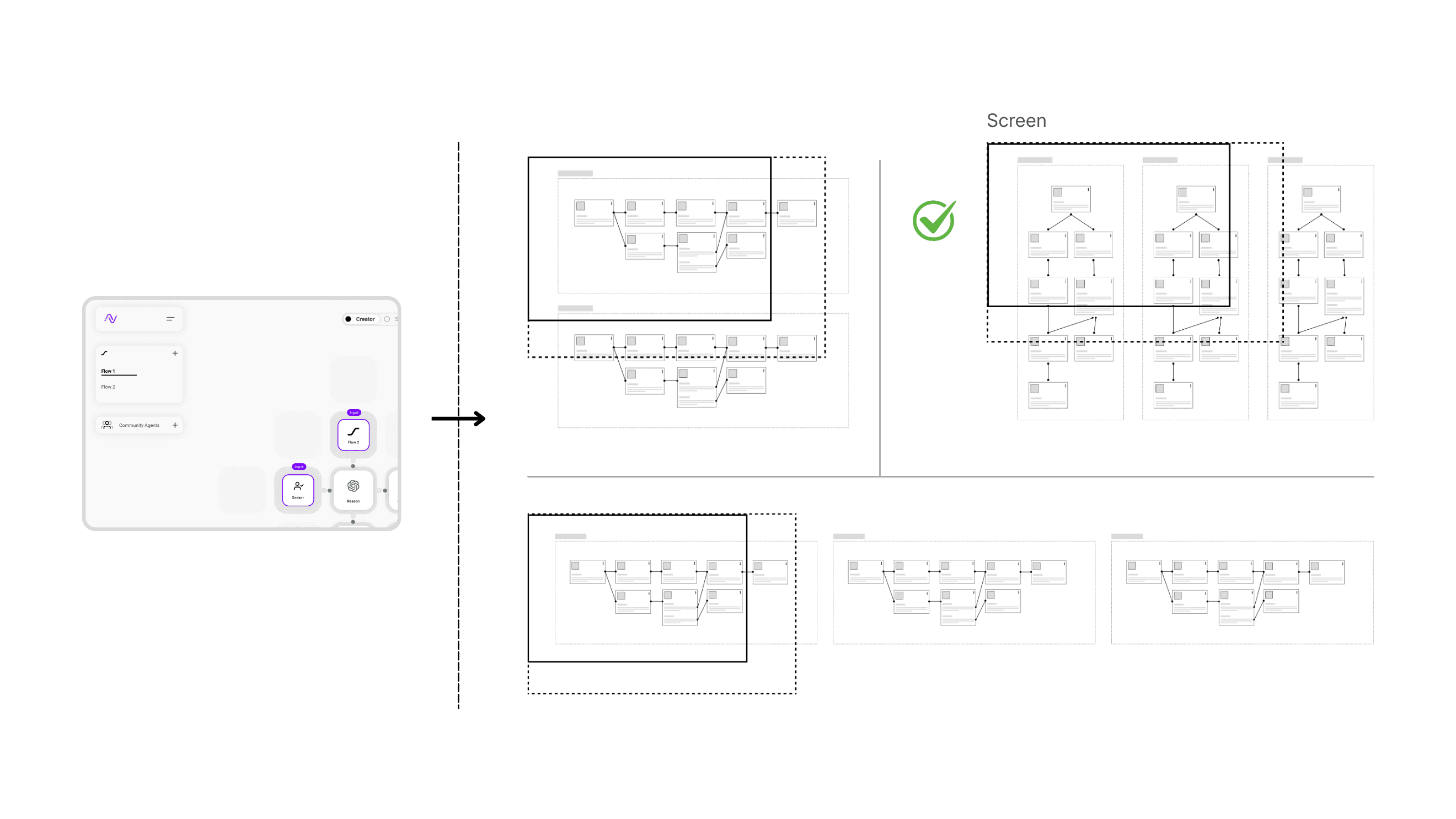
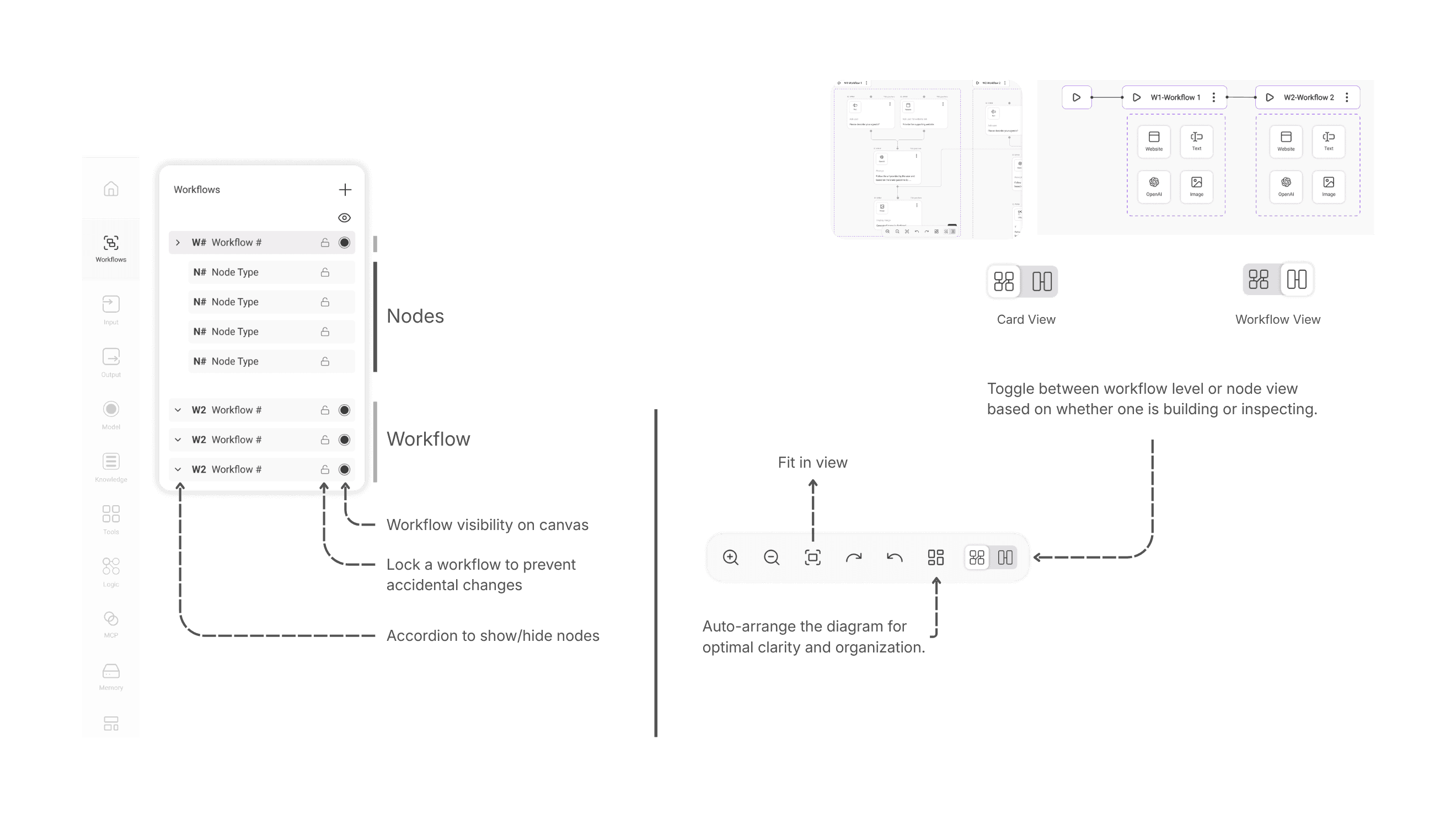
As agents grow in complexity, a single linear flow stops being enough. Guardrails, evaluations, and parallel paths all need to exist somewhere.
Keeping them off-canvas means they stay invisible and untested. Bringing them onto the canvas as named, distinct workflows gives users a way to see the full system at once – and reason about it visually before running anything.
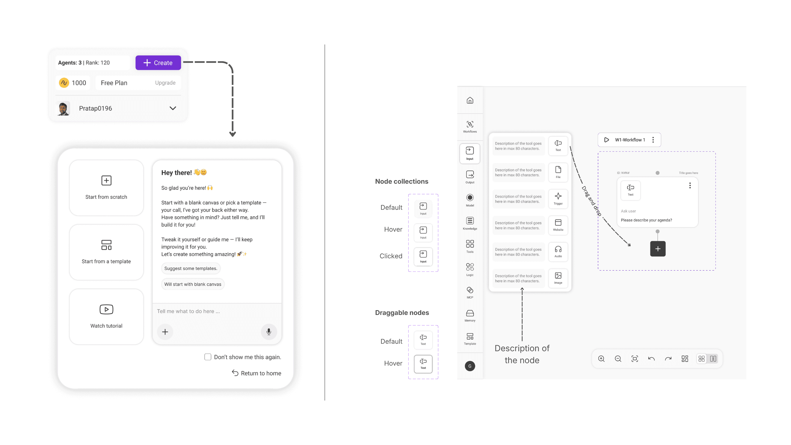
Lowering the cost of taking the first action
First-time users don't fail because the canvas is complicated. They fail because they don't know what to put on it.
We lowered the cost of that first action in three ways:
- a conversational entry point that turns intent into a starting structure,
- templates that show what a complete agent looks like, and
- plain-language node descriptions that explain capability at the moment of decision.
The blank canvas is still there. It's just not the only door in.
Keep users building where their attention already is
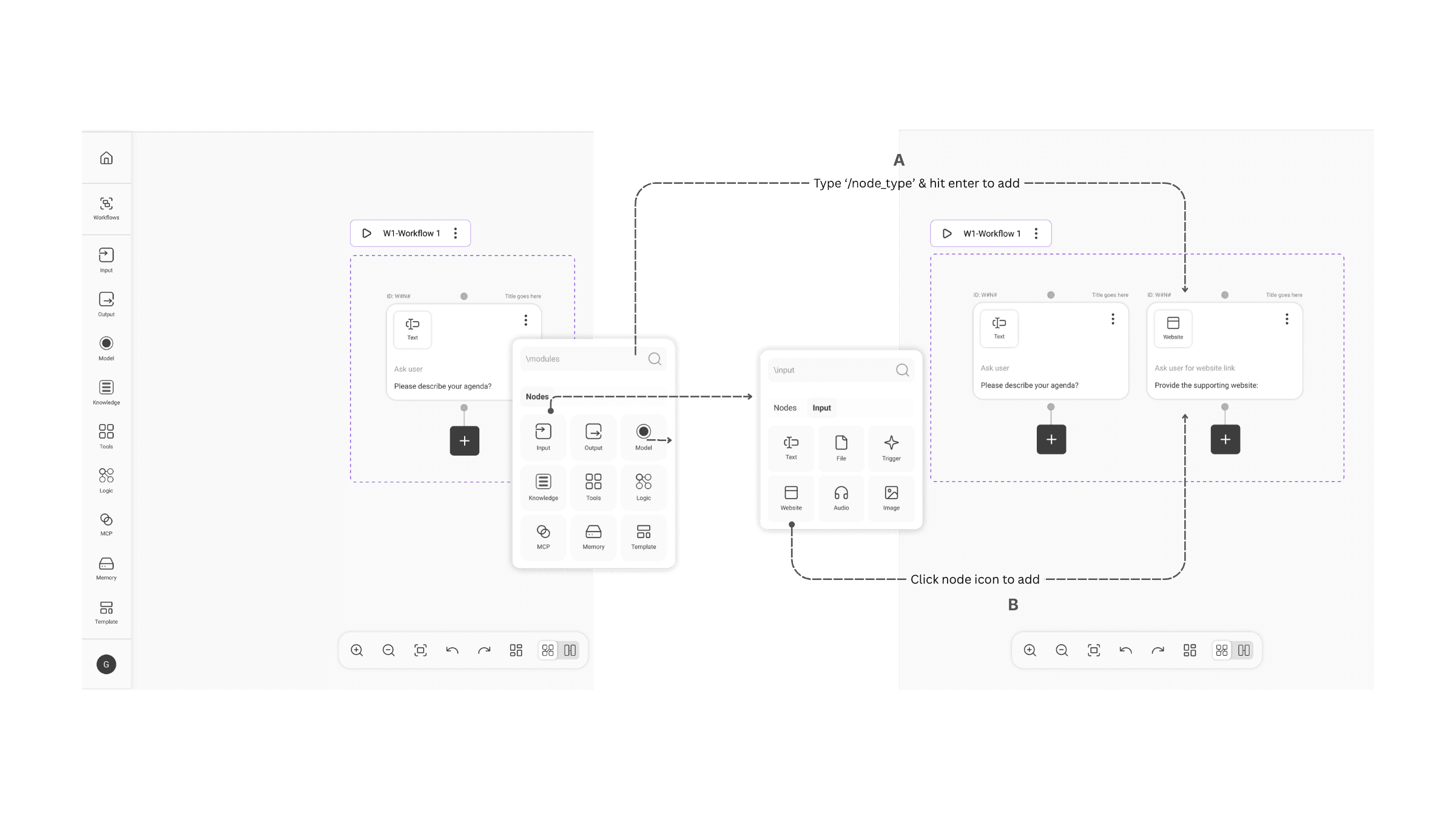
Node creation is inline and search-first. A plus button at the end of every open card opens a minimal node picker – no descriptions. Users type to filter, click to add.
The decision was deliberate: at the moment of adding a node, users already know roughly what they need. What they don't need is to stop and read about it as they progress from beginner to expert levels.
There’s always a tension between control and autonomy – especially in Agentic systems.
Design Decisions 2
Design decisions against the existing system.
Orphan cards
The architecture had no concept of a parked node. It was built for a form-based interface where every step was configured before it joined a flow. No in-between state was possible – the form didn't allow one.
The canvas did. We pushed for orphan cards: nodes removed from a flow but not deleted, staying visible and flagged on the canvas. It required an architecture change.
The argument that convinced engineering: deleting a step is a permanent answer to a temporary question. The canvas should hold the ambiguity, not force a decision.
Orphan cards became a first-class canvas state. Flagged, not broken. Neutral unless they affect an active workflow. And as the product evolved, they unlocked something we hadn't fully anticipated – a natural way to move a node from one workflow to another, without rebuilding it from scratch.
Errors explained where they occur
The existing system surfaced errors at the end – a validation pass before execution that listed everything wrong at once. Clean from an engineering standpoint. Unusable from a human one.
When something breaks mid-build on a canvas, the user's attention is on the card in front of them. An error list at the end requires them to remember what they were doing, navigate back, and reconnect the problem to the context they've already left. By then the thread is gone.
We moved errors inline. They surface where they occur, on the card they belong to, at the moment they're relevant. But we didn't stop at surfacing them – the system suggests a fix, and in most cases can apply it in one click.
This isn't error handling. It's Agentic help – the system acting as a collaborator that notices problems and offers solutions without interrupting the flow of building. The canvas stays the workspace. The user stays in motion.
Where it is now
What exists today. What's still unresolved.
→ What exists
Working visual builder Internal alpha live with early creators and enterprise pilots. Agents successfully deployed across SME workflows.
0→1 design system Canvas, cards, side sheet, toolbar, workflow view, error states, entry paths – all designed from scratch without an existing component library.
→ What's unresolved
Three design problems that remain genuinely open:
Context-aware model suggestions – the system currently lists available models. The right design would infer the appropriate model from the node's stated intent. Nobody has solved this well yet.
Orchestrator-worker UI – as users build multi-agent systems, the visual abstraction breaks down. How do you represent an agent managing other agents without it looking like a nested mess?
Evaluator-optimizer node – how do you design for a node whose job is to judge and improve other nodes in real time? The interaction model doesn't exist yet.
Insights
What this taught me.
Creation beats configuration.
Structure that emerges through use scales better than structure demanded upfront. This applies beyond agent builders – anywhere you're asking someone to commit to a shape before they understand the material.
Mental models matter more than features.
If users can't form a mental model of what they're building, no amount of capability helps. The most important design work wasn't the canvas UI – it was the conceptual reframe that made the canvas make sense.
AI UX is about trust, not power.
The hardest thing to design isn't the capability. It's the legibility. Users don't need to fully understand what an agent is doing - but they need to feel like they could figure it out if they had to.
Confidence is the goal. Not comprehension.
"Designing AI systems isn't about exposing everything. It's about helping people feel confident using what they don't fully understand yet."